Designing the enterprise survey intelligence platform used by hundreds of clients to understand customer sentiment — from a blank canvas to a mature product system.
VitalSigns is Bizrate Insights' flagship enterprise SaaS product — a dashboard that helps hundreds of retail and e-commerce brands understand what their customers are saying through post-purchase surveys and sentiment analysis.
When I joined as the founding UX director, the product had no design system, no research practice, and a UI that had grown organically without direction. I built all of that from scratch — and kept building as the product and team evolved over six years.
Enterprise clients were generating enormous survey data — but the existing interface made it difficult to surface meaningful insights quickly. Dashboards were dense, inconsistent, and required significant training to interpret.
The core challenge: how do you design for data complexity without overwhelming the user? Clients ranged from sophisticated analysts to marketing directors who needed a story at a glance.
There was also no design system in place — every new feature was designed in isolation, creating visual inconsistency and slowing development.
I needed to ship a better product today while building infrastructure for a better product tomorrow.
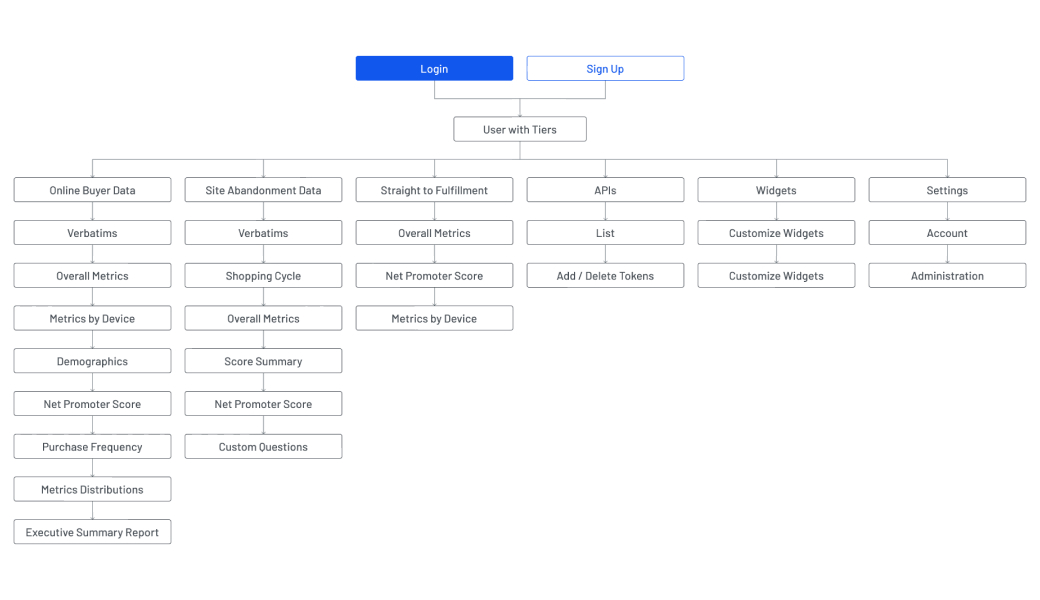
Working through information architecture and brand positioning with the team.
The VitalSigns information architecture — mapping the full product hierarchy from login through tiered data access.
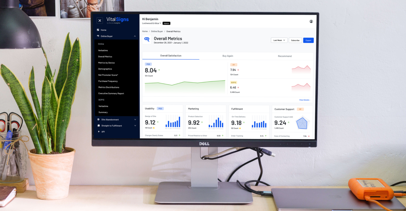
The redesigned VitalSigns introduced a layered dashboard architecture — a summary view with clear KPI signals at the top, and progressive detail available on demand. A decision-maker can get the story in 30 seconds. An analyst can spend an hour in the data. Both feel intentional.
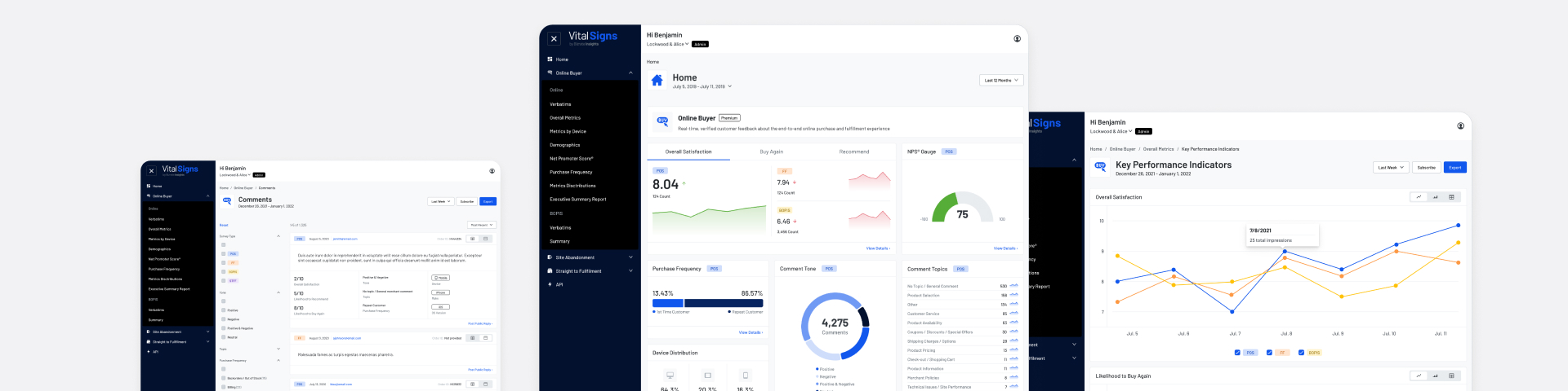
The data visualization framework standardized how survey data is presented across all views — consistent chart types, color encoding for sentiment, and annotation patterns that put context alongside the numbers.
The design system gave engineering a shared vocabulary and cut the time from design to dev significantly — all documented in Figma and accessible to the full team.
The redesigned VitalSigns Overall Metrics view — clean navigation, at-a-glance KPIs, and drill-down detail on demand.
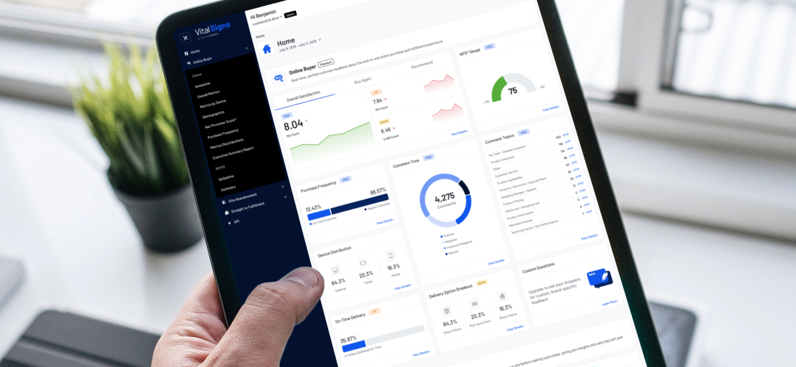
VitalSigns Home dashboard on iPad — real-time survey data, NPS gauge, comment topics, and device distribution at a glance.
Beyond the metrics, the most meaningful outcome was establishing design as a core function at Bizrate Insights. What started as a single designer with no process became a design organization with systems, a research practice, and a shared standard of craft.