
From agency vetting and selection through brand vision, design language, and launch — leading a full corporate site reinvention that now anchors everything we build.
The Bizrate Insights corporate site was overdue for a full reinvention. The existing site no longer reflected the company's positioning, the quality of its product, or the sophistication of its enterprise clients. This wasn't a refresh — it was a ground-up rethinking of how the company presents itself to the world.
I led the entire initiative: vetting and selecting an outside agency, defining the brand vision and design language, working through six rounds of design ideation, and seeing it through to a live, internally managed site that now serves as the creative north star for everything else we produce.
Before a single pixel was drawn, the work was organizational: identifying, interviewing, and vetting multiple design and development agencies. I led that process — developing the evaluation criteria, running discovery conversations, reviewing portfolios, and aligning internal stakeholders around what we actually needed versus what we thought we wanted.
We selected Huemor — a studio with a strong track record in B2B SaaS positioning and web design — based on their strategic thinking, not just their portfolio. The agency relationship required constant creative direction: I was the bridge between our internal voice and their external execution.
The design went through six distinct rounds of ideation before we landed on the direction that now defines the site. Each round wasn't a failure — it was a refinement of what we were actually trying to say and how we wanted to say it.
The final site is clean, confident, and built to scale. Every page template was designed as a reusable system — so the internal team could create new content without breaking the design language. The visual identity established here now waterfalls into our email design, sales materials, conference assets, and product UI.
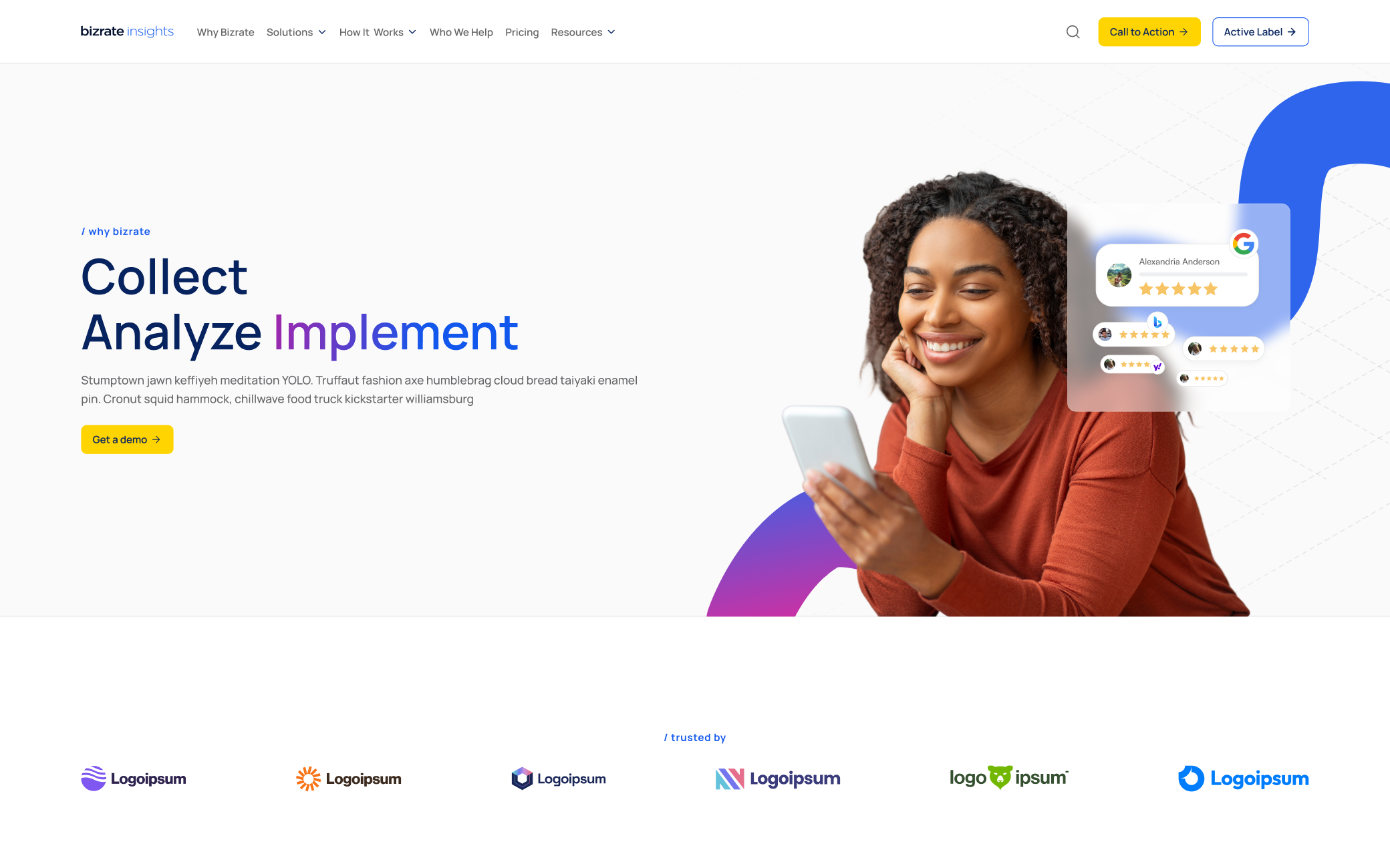
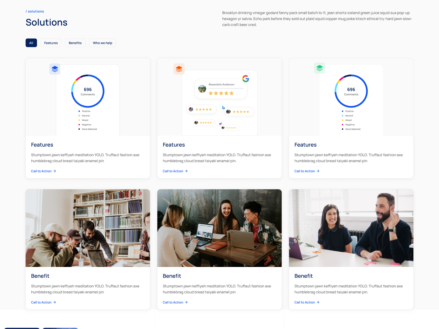
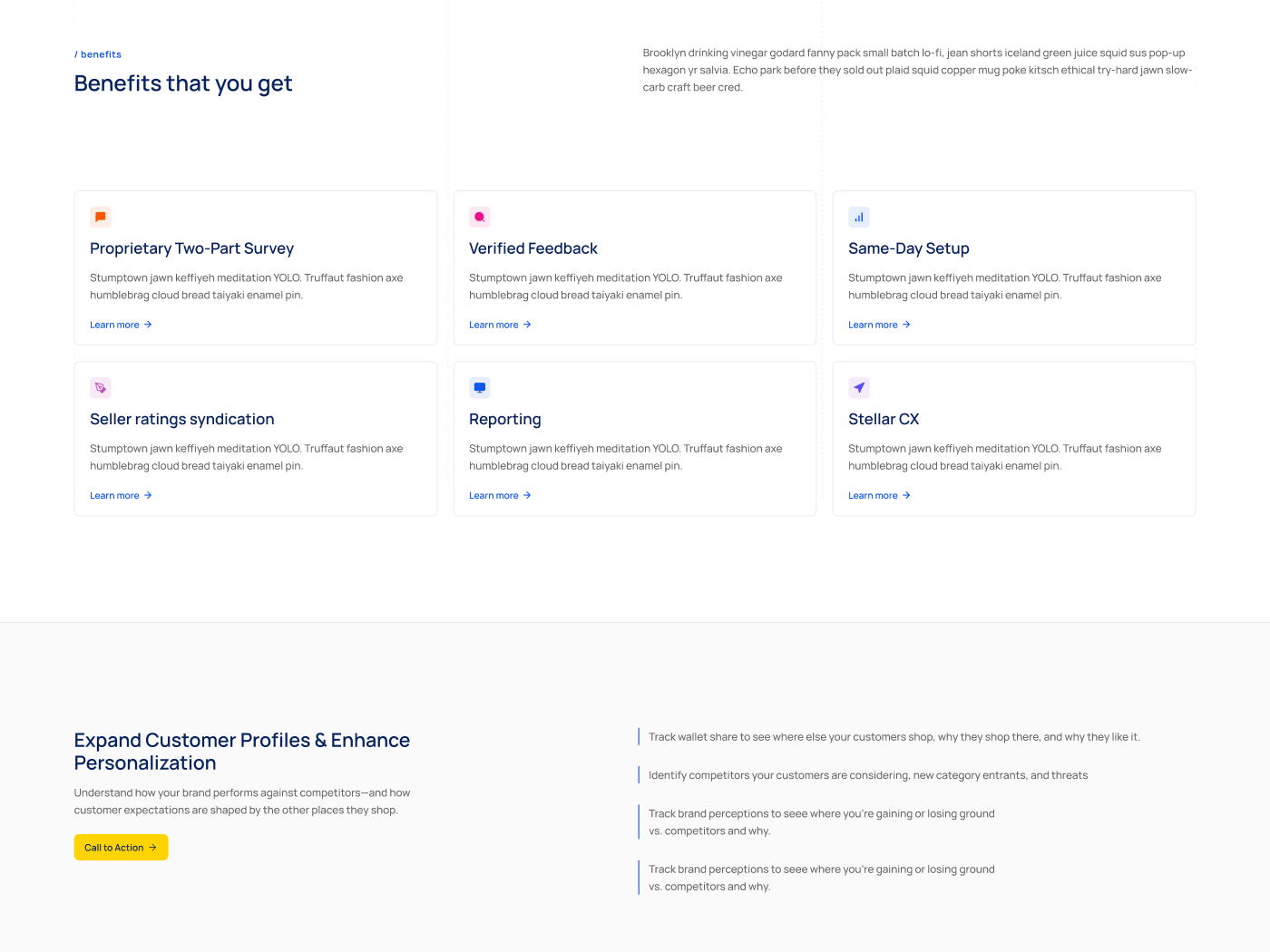
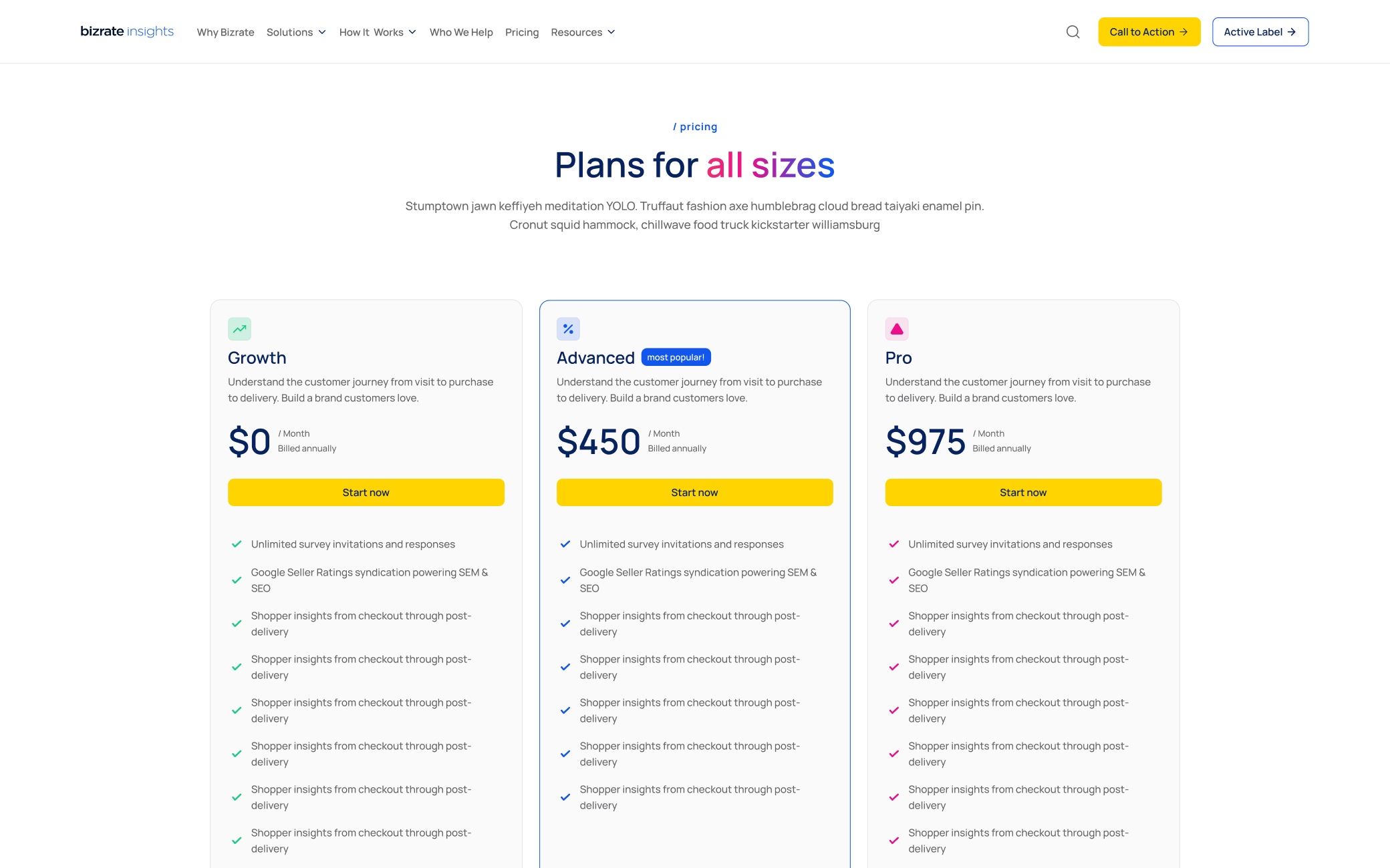
bizrateinsights.com — homepage, product pages, and resource templates.
The site launched on schedule and handed off to our internal team without losing design fidelity — a rare outcome for agency partnerships of this scope. More importantly, the design language we established became the foundation for a broader brand refresh: the same visual system now informs our email design, white papers, sales decks, conference materials, and product UI.
What started as a website project became the definitive articulation of what Bizrate Insights looks like — and the creative reference point the entire organization now works from.