All work
SaaS · Data Design · Client Deliverable

Performance
Summary Report.

Redesigning the flagship client-facing report that turns months of survey data into a clear, compelling story — one that clients actually read. Then evolving it with AI-driven insights delivered straight to the inbox.

Data Visualization Report Design UX Writing Print & Digital AI Integration Figma
Company
Bizrate Insights
My role
Executive Director of UX
Deliverables
Report template system, data visualization framework, AI Pulse Report integration, print and digital PDF
Launch
February 1, 2026
Monthly Pulse Report — Advanced, Pro & Enterprise tiers
Performance Summary Report
01
Overview

The Performance Summary Report is Bizrate Insights' primary client deliverable — the document enterprise clients use to present survey findings to their internal stakeholders, board members, and marketing teams.

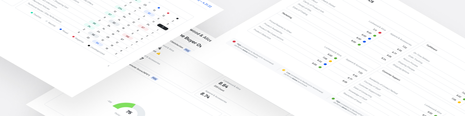
The existing report was functional but visually dated. Charts were inconsistent, hierarchy was unclear, and the overall impression didn't reflect the quality of the underlying data. I redesigned it from the ground up — turning it into a system, not a document.

That foundation then became the platform for something bigger: integrating AI-generated sentiment analysis directly into the monthly Pulse Report, delivering premium insights to merchants' inboxes without requiring a single login.

02
The challenge

Reports had been assembled manually for years — a patchwork of charts from different tools, inconsistent fonts, and a layout that had never been designed intentionally. Each one took significant time to produce and still didn't look polished.

The deeper problem was information architecture: what story should the report tell, and in what order? The data was rich but the existing format buried the most important signals under tables full of numbers. Clients needed a clear narrative, not a data dump.

A second layer of complexity emerged as the product evolved: how do you surface AI-generated insights — Key Strengths and Key Opportunities — in a way that feels native to the report format, and is genuinely useful to a merchant who may never log into the platform?

"Data is only as valuable as your ability to communicate it."
03
Product context

The Monthly Pulse Report mirrors the high-level dashboards in VitalSigns — giving premium merchants a monthly summary of their performance data. The goal was to extend that value further: delivering AI-driven insights directly to the inbox, without requiring merchants to log in to access them.

Feature brief
The AI Comment Summary — previously only available inside VitalSigns — has been integrated into the Monthly Pulse Report. The report now features Key Opportunities and Key Strengths sections, with POS and Fulfillment broken out as separate summaries, mirroring the Survey Type filter available in the Buyer Comments Page. Merchants in the Advanced, Pro, and Enterprise tiers see these insights on the 1st of each month, covering the previous month's comment data.
All merchants · Daily
VitalMail
Daily performance pulse with high-level Key Themes. Broad visibility for every tier — the baseline touchpoint.
Advanced, Pro & Enterprise · Monthly
Pulse Report + AI Insights
Monthly deep-dive with AI-generated Key Strengths and Key Opportunities broken out by survey type. Reserved for premium subscribers.

This distinction became a major differentiator for sales and client success: while all merchants receive the daily VitalMail with basic themes, actionable AI-identified opportunities and strengths are exclusive to the monthly Pulse Report — a clear, tangible benefit of the Advanced tier and above.

04
Approach
1
Content audit & narrative mapping
Reviewed a year's worth of reports and mapped what data was consistently most important to clients. Worked with client success to understand what questions clients were actually asking when they received the report.
2
Visualization framework
Standardized the chart and graph library — when to use a bar vs line vs distribution chart, how to encode sentiment with color, and how to annotate for clarity. Created a data visualization style guide used across all outputs.
3
AI section integration
Designed the Key Strengths and Key Opportunities sections to feel native to the existing report structure — not bolted on. POS and Fulfillment summaries are visually distinct but consistent, matching the Survey Type filter logic merchants already use in VitalSigns.
4
Fallback state design
Designed a thoughtful empty state for cases where an AI summary couldn't be generated — with clearer messaging and a deep link that drops merchants directly into the Buyer Comments Page in VitalSigns, with the correct survey type filter pre-applied.
5
Template system & print/digital optimization
Built a modular template system in Figma and InDesign. Sections snap together, charts auto-scale, and the AI sections slot in cleanly. Two output versions from one source: a digital-first PDF for email and a print-ready version for boardroom presentations.
Performance Summary Report in use

The Performance Summary Report — designed for how enterprise clients actually read it.

05
Inside the report

The redesigned report leads with an executive summary, moves through performance data and trend charts, and culminates in the AI-generated sentiment sections — Key Strengths and Key Opportunities broken out by survey type. Each page is designed to stand alone in a boardroom presentation while working as part of a cohesive narrative end to end.

Performance Summary Report — Page 1
Performance Summary Report — Page 2
Performance Summary Report — Page 3
Performance Summary Report — Page 4

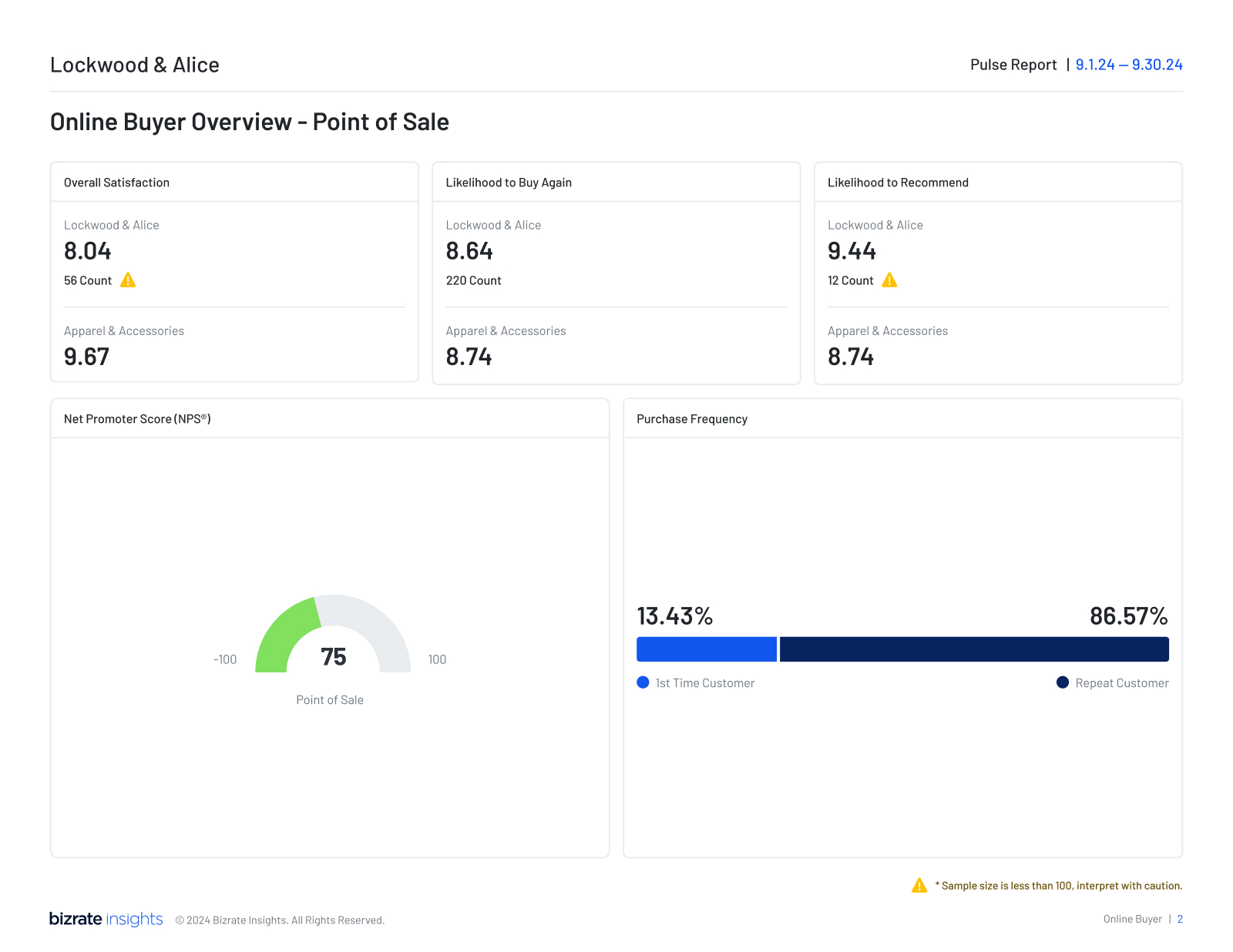
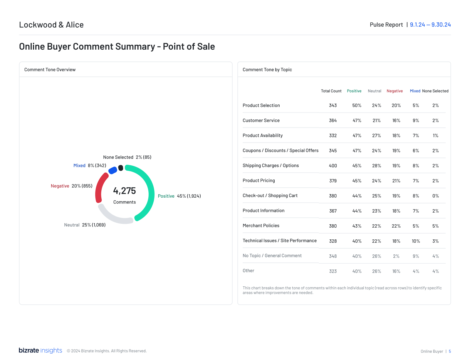
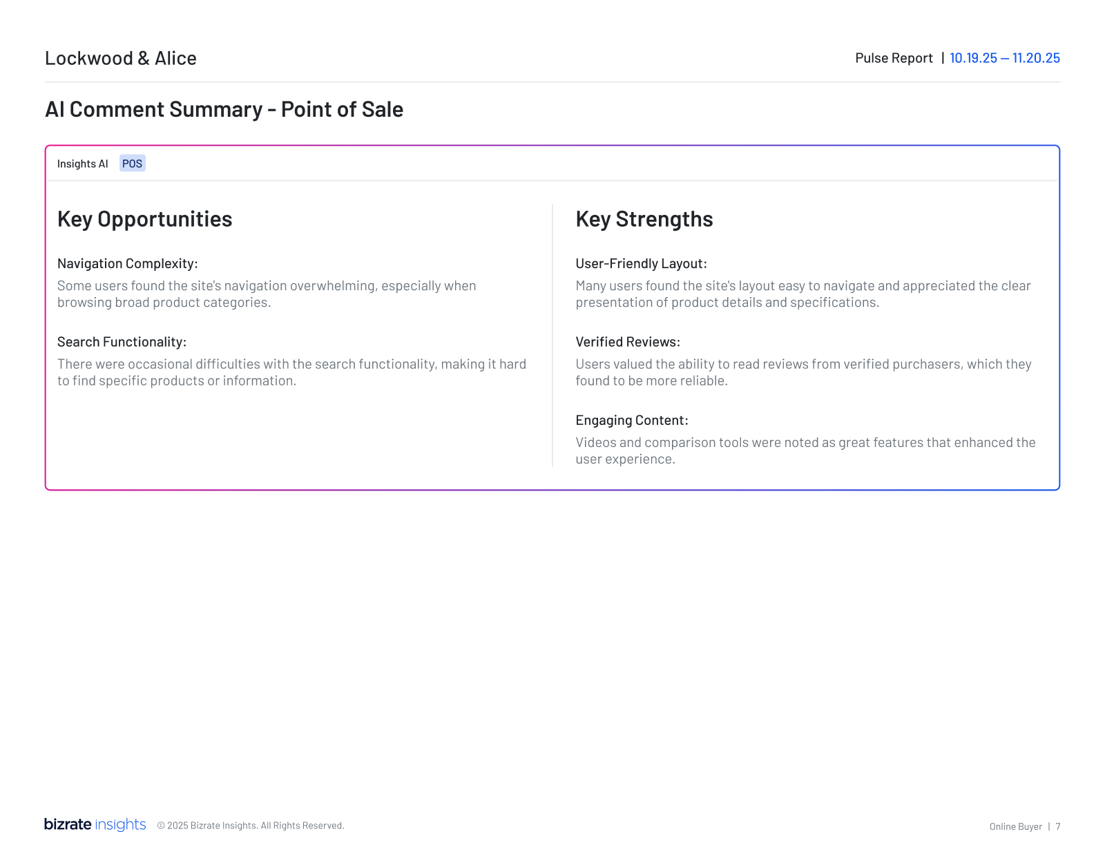
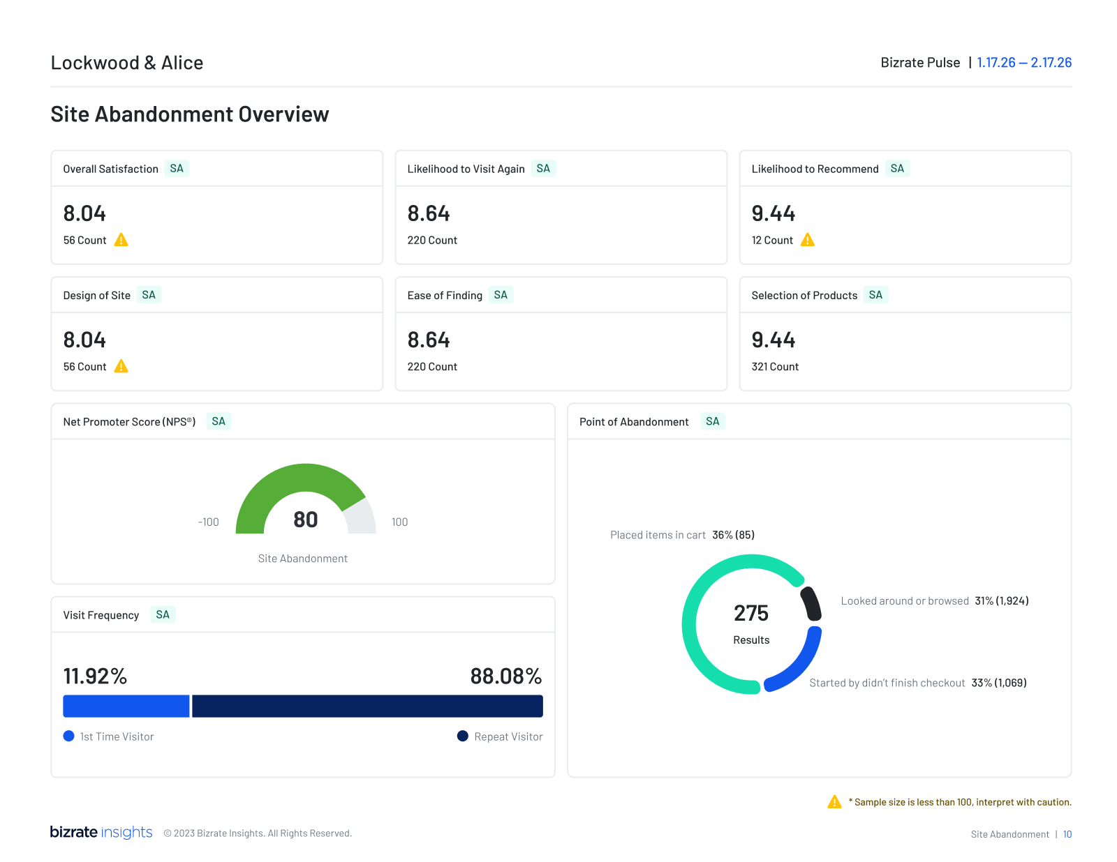
Selected pages from the Monthly Pulse Report — performance data, trend analysis, and AI-generated sentiment insights.

06
Outcomes
Significant reduction in production time per report after template adoption
Client engagement with report content, measured through client success feedback
1
Unified visual language now used across all client-facing documents and email reports
Sales & marketing impact
The AI Pulse Report integration became a concrete selling point for the Advanced tier and above — a tangible, monthly demonstration of value that competitors can't easily replicate. For marketing, it sharpened the positioning: VitalMail is the daily pulse for every merchant; the Pulse Report is the premium deep-dive that makes the upgrade worth it.
Next project
Comment Sentiment Analysis