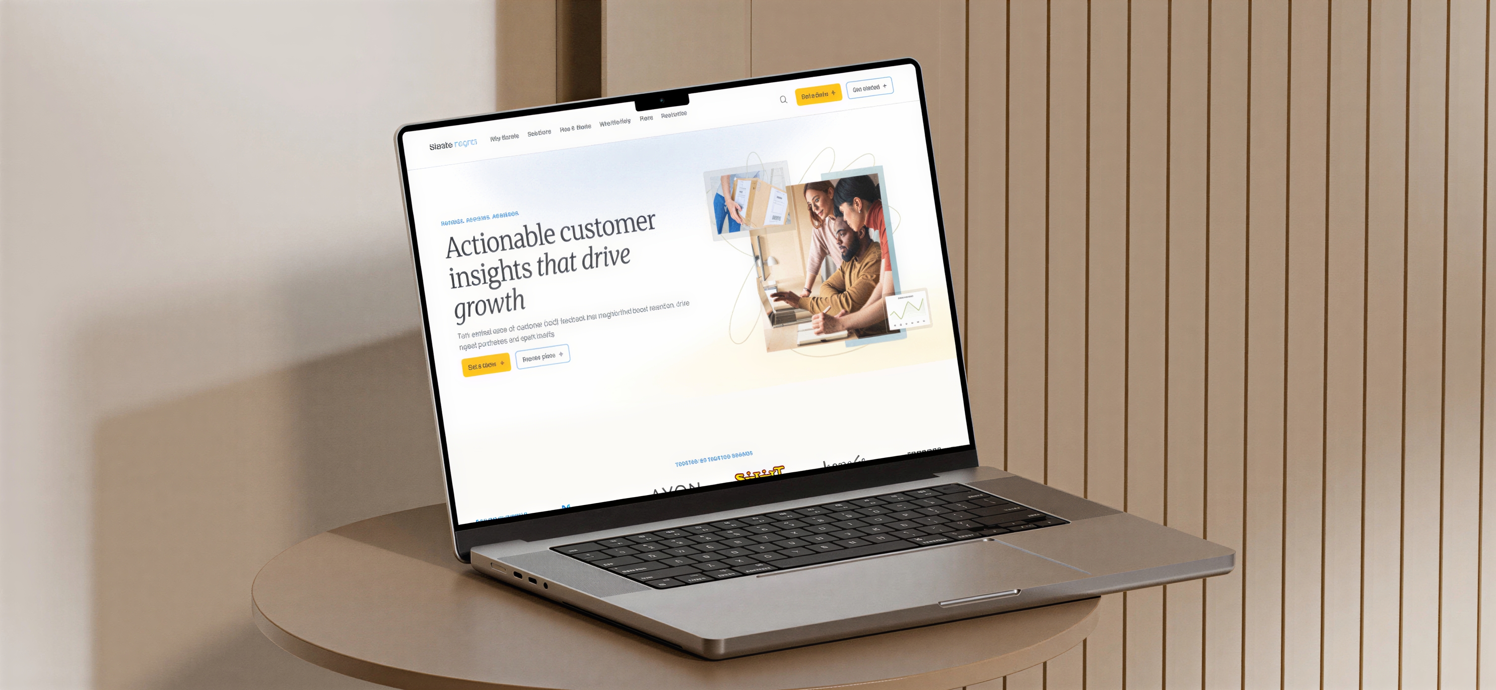
Positioning a smaller company in a unique way by putting its best asset front and center: real people.
Bizrate Insights is a smaller company in a space with much larger brands. It couldn't, and shouldn't, try to compete with them on their terms. The goal was to position ourselves in a unique way.
One of our best differentiators is our white glove treatment. Every client has a real, assigned customer success team member who can be contacted, rather than AI, automation, or self service. Real people help you, and real people crunch the numbers and give advice and direction on how best to apply your user feedback, through quarterly reports, performance reports, Zoom calls, or whatever a client needs.
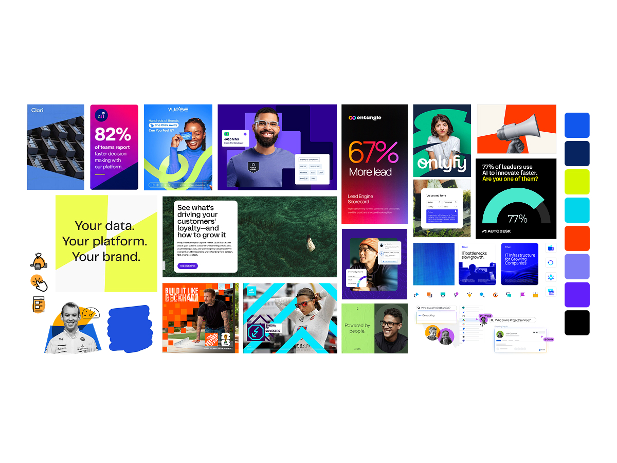
We wanted to highlight the human. That meant moving away from high contrast blue and pink gradients and stock imagery, and toward real people, natural textures and colors, and humanistic typography and language.
The work started with a brand competitor audit of 20 brands in the space, plus brands we admired for their design principles.
I then led a collaborative call with stakeholders to talk through what they liked and disliked about those brands. That conversation gave us a shared vocabulary before any design work began.
A brand exercise with the team defined who we are in five words. The final list has six, because Partner earned its place.
We defined five core audiences for the brand, each with their own goals and what they need from us.
We created four possible mood boards for the team to react to, using imagery, color, fonts, and textures to find the right feel. We settled on Grounded Intelligence.
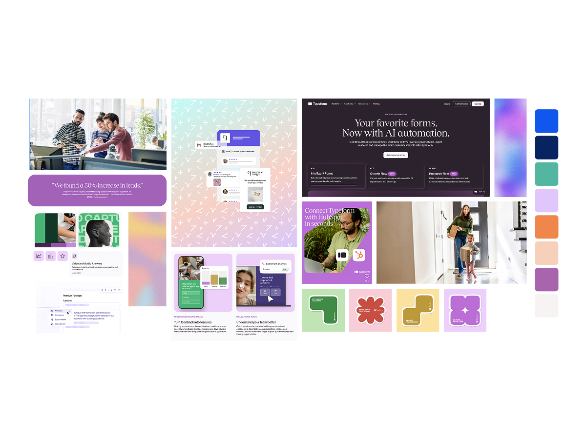
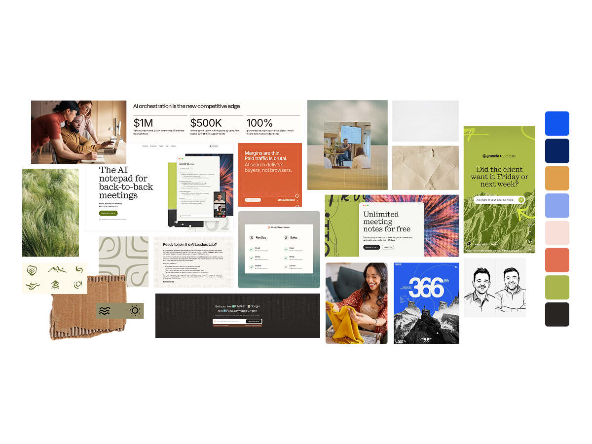
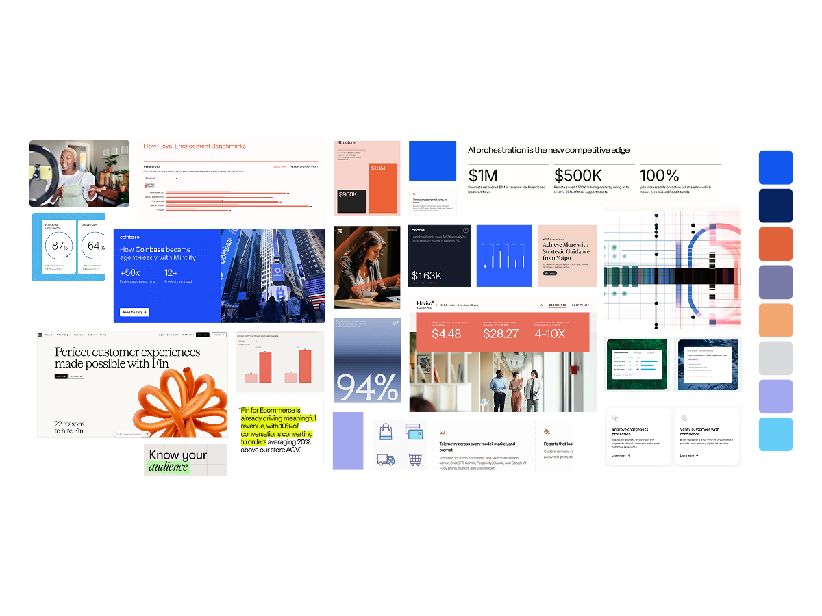
Once the direction was chosen, I provided mockups of how it would look and be applied across the touchpoints that matter most.
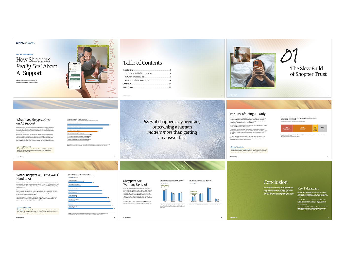
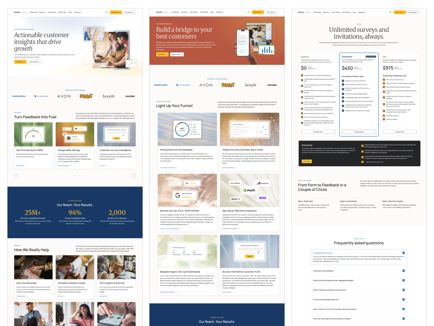
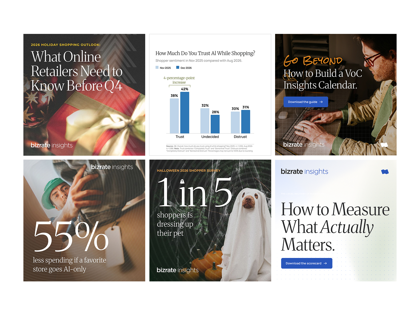
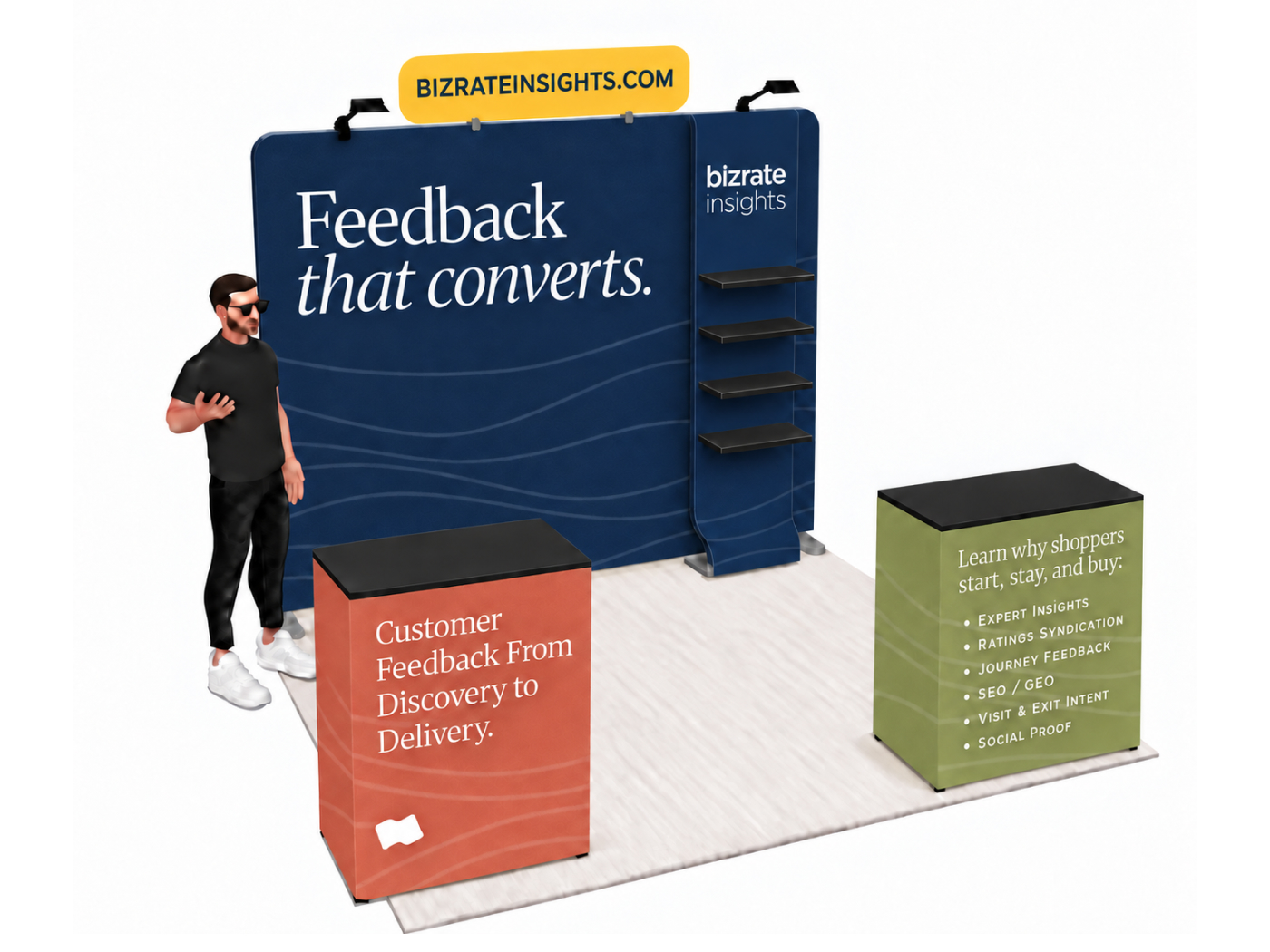
The new brand applied across white papers, web, social, and conference materials.
From there I refined the color palette and set brand guidelines for color, fonts, texture, and imagery. We started applying them to every web page and created all new custom graphics, ready to launch.
The result is a brand that looks like what we actually are: real people helping you make sense of your customers' feedback.
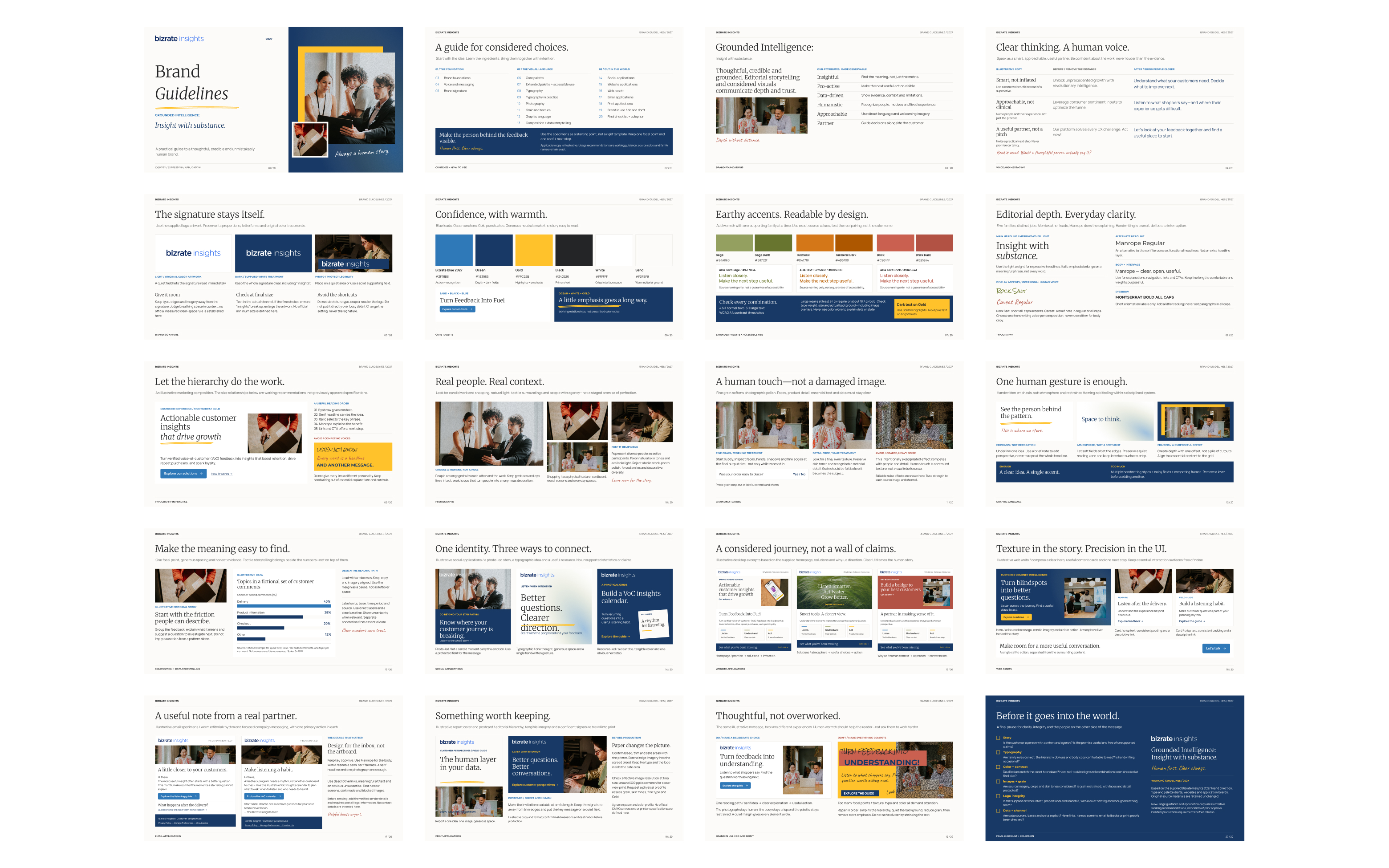
Brand guidelines covering color, typography, texture, and imagery.